I recently spent some time going through The Good Bug website.
What caught my attention first was the visual design.
The typography is bold. The layouts feel current. Product imagery gets enough room. Colors help distinguish categories and products. The website feels considerably more customized than the typical Shopify storefront.
But I wanted to look beyond whether the website looks good.
I wanted to look at it the way I normally look at an e-commerce business:
- What is the customer being asked to understand?
- How is the website helping them choose?
- Where is the UI reducing friction?
- Where could the buying experience potentially be improved further?
Because for me, Shopify development and CRO are closely connected.
A developer can build a technically perfect store that still makes buying difficult.
A designer can create a beautiful website that still converts badly.
The real opportunity is when development, UX, merchandising and CRO work together.
And there are several things The Good Bug does particularly well.
They Start With the Customer's Problem
One of the strongest things on the live homepage is the prominence of Shop by Concern.
Visitors can browse areas such as Digestive Health, Weight Management, Sleep & Recovery, Protein & Fiber, Women's & Skin Health and others.
I like this because customers rarely think in terms of product architecture.
They think:
- “I'm bloated.”
- “My digestion isn't great.”
- “I want to manage my weight.”
- “I want to sleep better.”
The website lets the customer start from that problem.
That sounds simple, but it is good e-commerce UX.
The less knowledge someone needs before they can start shopping, the easier product discovery becomes.
Their Pack Selector Is a CRO Element, Not Just a Variant Selector
The Bye Bye Bloat product page is a good example.
The live page gives customers four options:
- 15 Days
- 1 Month
- 2 Month: Most Popular
- 3 Month: Best Result
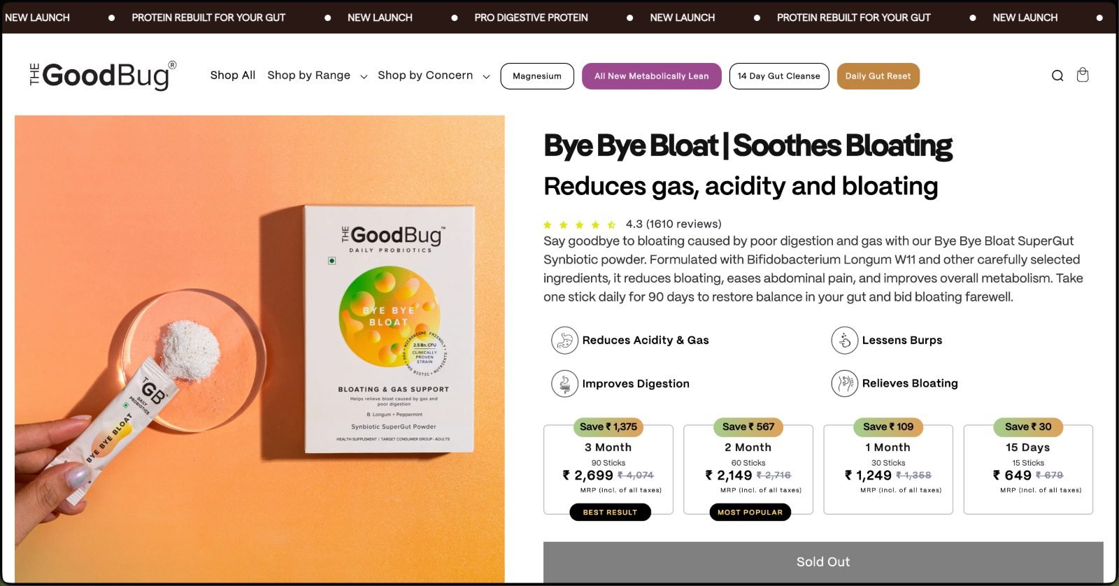
This is more interesting than simply showing:
1 pack
2 packs
3 packs
The product is being framed around duration of use.
That changes the customer's decision.
Instead of:
“How many packs should I order?”
the question becomes:
“How long should I use this?”
The “Most Popular” and “Best Result” labels then help guide the choice further.
This is a perfect example of where Shopify development and CRO meet.
Technically, these are purchase options.
Commercially, they are choice architecture.
The Product Page Answers the Main Questions Early
The Bye Bye Bloat PDP quickly communicates:
- the product
- the main benefit
- rating and review volume
- a short explanation
- core benefits
- pack options
- price
- savings
- purchase action
That hierarchy matters.
On any PDP I work on, I want the first section to answer:
- What is this?
- What does it help with?
- Why might I trust it?
- Which option should I buy?
- How much does it cost?
A customer shouldn't need to scroll through half the website just to understand the offer.
The Good Bug handles that part well.
One of the Best CRO Elements Is Actually the “Not for You” Message
This was probably the part I liked most.
The Bye Bye Bloat page doesn't simply tell everybody to buy it.
The page asks users about symptoms, explains who the product is intended for, and then specifically states that if frequent constipation is the issue, Bye Bye Bloat may not be the right product. It directs those shoppers toward Smooth Move instead.
That is strong conversion thinking.
CRO isn't about making everybody click Add to Cart.
It is about helping the right customer make the right decision.
A message like:
“This may not be the product for you.”
can actually increase trust.
The customer feels like the brand is helping them choose rather than simply pushing a sale.
For health and wellness brands, that matters a lot.
They Don't Force Every Product Into Exactly the Same Buying Journey
Another good example is Gut Balance.
Unlike Bye Bye Bloat, the customer first sees a choice between:
- Probiotics
- and
- Probiotics + Detox Kit.
Only after that does pack duration come into the decision.
That's a more complex purchase journey.
And that's exactly my point.
Not every product needs the same PDP.
One product may need:
Pack → Buy
Another may need:
Product configuration → pack → buy
Another product may need more education before purchase.
The customer journey should reflect the complexity of the offer.
This is something I think many Shopify brands get wrong.
They create one product template and then expect every SKU to fit inside it.
From a development perspective that may be convenient.
From a conversion perspective, it can be limiting.
Repeating the Purchase Selector on a Long PDP Can Be Intentional CRO
On Bye Bye Bloat, the complete pack selector appears again further down the live product page.
At first glance, somebody could call this unnecessary repetition.
I wouldn't automatically do that.
The page is long.
A shopper may see the first buy box and still be uncertain.
They then scroll through product suitability, how it works, lifestyle advice, ingredients and proof.
By that point, they may be ready to buy.
Giving them another purchase opportunity means they don't have to travel back to the beginning of the page.
That makes sense.
However, this is one area I would still test.
What I would test
Full repeated selector vs compact CTA vs sticky mobile Add to Cart.
My hypothesis would be that after the user has already seen the full pack structure once, they may not need the whole component repeated.
A lighter buying prompt may achieve the same goal with less visual repetition.
But without their analytics, this remains a test hypothesis, not a claim that their current implementation is wrong.
The PDP Continues Selling After the Buy Box
Another thing I like is that the page doesn't stop after Add to Cart.
Bye Bye Bloat continues into:
- product suitability
- how it works
- usage guidance
- consultation support
- ingredients
- proof
- customer testimonials
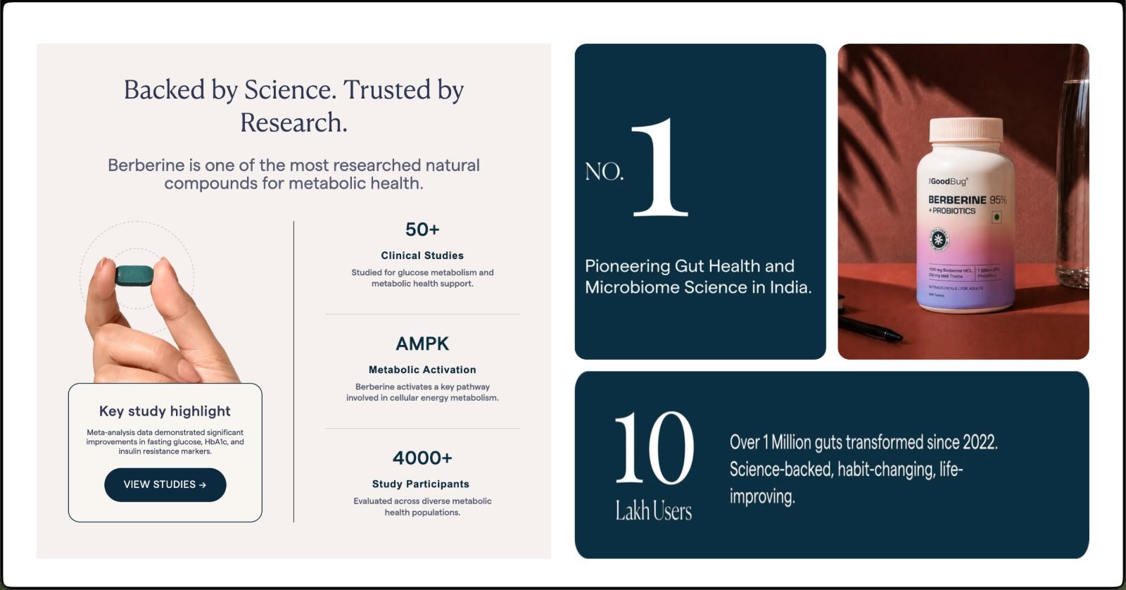
This is how I think about long-form product pages.
Content below the fold should not exist because somebody wanted to make the page longer.
It should answer objections.
One customer wants ingredients.
Another wants reviews.
Another wants to understand the mechanism.
Another wants reassurance that the product is appropriate for their symptoms.
A strong PDP supports all of those decision styles.
Their Homepage Merchandising Is Strong
The live homepage also does something I like from a merchandising perspective.
It doesn't simply show one large “Shop All” grid.
It combines concern-based discovery with individual product recommendations and promotional emphasis around launches such as Pro Digestive Protein.
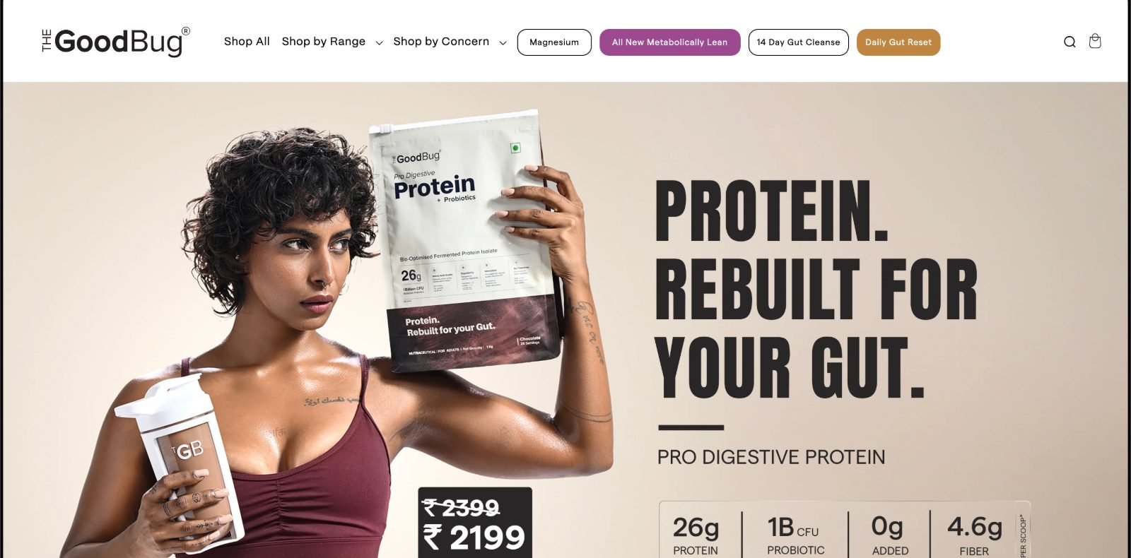
That makes the homepage function more like a merchandising surface than a static brand brochure.
This is particularly important for D2C brands with several products.
A homepage should help someone answer:
Where should I go next?
If it only looks beautiful but doesn't help product discovery, it is not doing enough.
The Mobile Experience Answers a Different Question First
Most of what I described so far is visible on a desktop screen.
But a large share of D2C traffic in India will never see that layout.
So I looked at the same store on a phone.
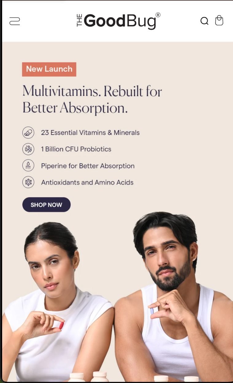
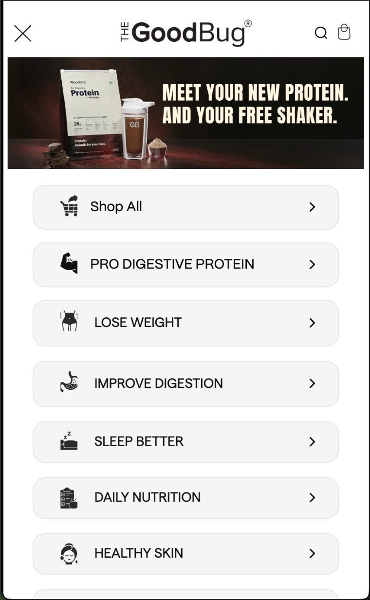
The menu is the part I find most interesting.
It doesn't open into a category tree.
It opens into a list of outcomes.
- Lose weight.
- Improve digestion.
- Sleep better.
- Daily nutrition.
- Healthy skin.
Each one is a full-width row with an icon and a chevron.
That is a good decision on a phone.
A customer isn't reading a taxonomy.
They're scanning for the line that matches their own problem, with a thumb.
And the labels are verbs, not categories.
There is one inconsistency worth pointing out.
The navigation says Lose Weight, Improve Digestion and Healthy Skin.
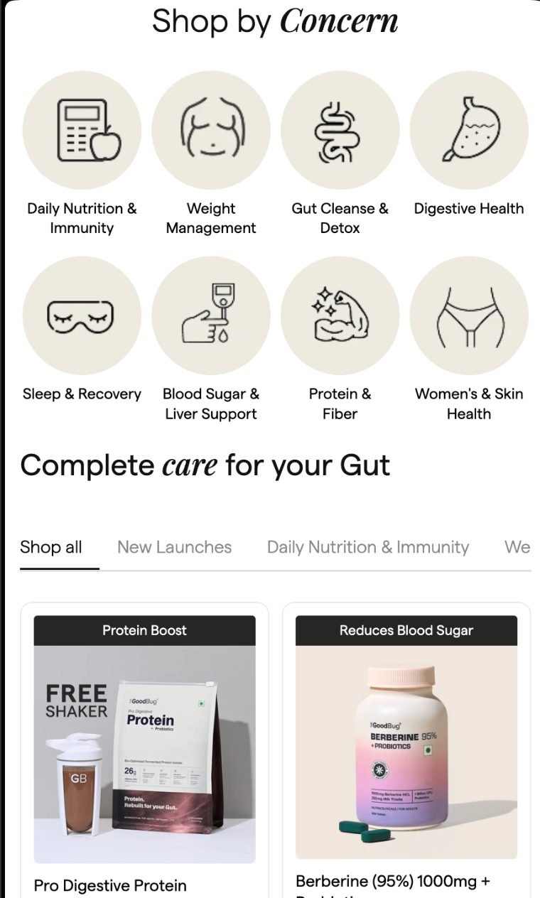
The concern grid on the page says Weight Management, Digestive Health and Women's & Skin Health.
Those are the same concerns described in two different vocabularies.
It isn't a serious problem.
But concern-led merchandising only compounds if the language is consistent everywhere the customer meets it.
Menu, collection titles, product page, ads, landing pages.
One vocabulary is easier to remember, and easier to search for.
The concern grid itself works well on a small screen.
Eight circular icons, four across, two rows.
It's scannable without scrolling and the illustrations differentiate faster than text would at that size.
Below it, the collection tabs scroll horizontally.
That pattern is common, and it comes with a cost.
The last label is cut off mid-word, so a customer has to discover that the row moves.
I'd want to know from analytics how many people ever scroll that row.
The product cards do something I like.
Each one carries a banner above the image with the reason to buy.
Protein Boost.
Reduces Blood Sugar.
That is merchandising inside the grid, not just a product name and a price.
The product page is where the trade-off shows.
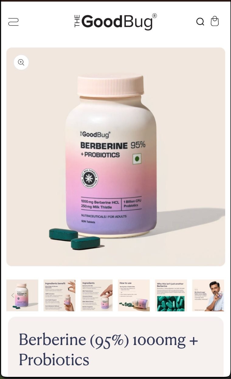
On desktop, the image sits beside the title, the pack selector and the buy button.
On mobile that column collapses, so the gallery takes the first screen almost entirely.
The title starts at the bottom edge of it.
The pack selector and the price sit below that.
So a customer who arrives from an ad already knowing what they want has to scroll before they can act.
What they do well is what sits inside that gallery.
The thumbnails aren't six angles of the same bottle.
- Ingredients and what each one does.
- How to use it.
- Why this isn't just another Berberine.
- A customer quote.
That is objection handling moved into the image carousel.
On a phone, that is a smart place to put it.
A swipe is cheaper than a scroll.
Someone who needs convincing can get the education without the page getting longer for everyone else.
There Are Still Areas I Would Test
Even strong websites should continuously be tested.
From the live experience, these are the areas I would explore first.
1. Repeated Buy Box vs Sticky CTA
As mentioned earlier, I would test whether a lighter second CTA performs better than repeating the complete selector.
2. Mobile Decision Density
A multi-option purchase interface can work brilliantly on desktop but feel considerably denser on mobile.
I would specifically measure interaction with each pack option, scrolling around the buy box and abandonment after variant selection.
3. Default Pack Selection
When you show:
15 Days
1 Month
2 Month
3 Month
the default state matters.
I would test whether:
- no default
- starter pack
- Most Popular
- or recommended duration
produces the best combination of conversion rate and AOV.
4. Product Discovery Between Similar Concerns
The site already does a good job of directing users based on concerns.
I would take that further by studying where shoppers move between similar digestive products.
If customers repeatedly compare two or three products, that may justify a clearer comparison experience.
5. New Customer vs Returning Customer Experience
The educational PDP structure makes sense for first-time buyers.
A repeat customer may simply want:
Choose pack → Add to Cart.
I would look at whether returning shoppers could be given a faster route to purchase.
What I Would Not Change
I wouldn't simplify the website just for the sake of making it minimal.
That's important.
Health and wellness products often require education.
The answer isn't automatically:
“Remove content.”
The answer is:
Organize the content properly.
A long PDP can work very well when the top of the page allows a confident customer to buy quickly and the rest of the page supports someone who needs more reassurance.
The Good Bug generally follows that principle well.
What D2C Brands Should Actually Learn From The Good Bug
I wouldn't tell another brand:
“Copy this UI.”
That is the wrong takeaway.
I would tell them to study the thinking behind it.
The real questions are:
- Can customers shop by their problem rather than understanding your catalog first?
- Are your variants presented as technical options or meaningful buying choices?
- Does every product genuinely deserve the same PDP?
- Are you helping customers identify when a product is not right for them?
- Does the page answer objections in the order they naturally occur?
- Can someone buy immediately if they are ready?
- Can someone learn more if they aren't?
Those questions matter more than copying somebody else's font or card style.
My Takeaway as an E-Commerce Growth Specialist
This website is a good example of why I don't separate Shopify development from CRO.
Development determines what experiences are possible.
UX determines how understandable they are.
Merchandising determines how products and packs are framed.
CRO determines what should be tested and improved.
And acquisition determines how valuable all of that becomes when paid or organic traffic lands on the store.
They are not separate problems.
They are parts of the same revenue journey.
- Traffic brings the customer in.
- UX helps them find the right product.
- Merchandising helps them choose.
- CRO removes hesitation.
- Development makes the experience work.
That is how I prefer to think about e-commerce growth.
And that is the main reason I found The Good Bug website worth studying.
Not because every brand should make a website that looks like theirs.
But because more brands should put this much thought into how customers actually make a purchase decision.
Sources: observations above are based on the live customer experience, checked September 2026:
By Vishal Pothur · Shopify, CRO & E-Commerce Growth. Screenshots are of thegoodbug.com, used here for commentary. No affiliation.
Free 30-min audit · No obligation